Crafted the Bold and Dynamic Brand Identity for Rendezvous CAFÉ, Capturing the Spirit of Racing
Client Overview:
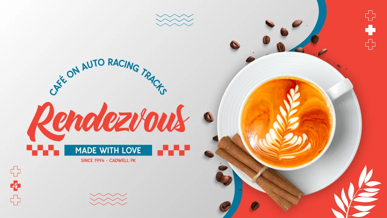
Rendezvous CAFÉ is a unique cafe located by the auto racing tracks, catering to racing enthusiasts, participants, and the supporting crew. Offering a lively atmosphere right next to the action, Rendezvous CAFÉ blends the thrill of motorsports with the comfort and relaxation of a cozy cafe, creating a one-of-a-kind experience for its patrons.
Project Overview:
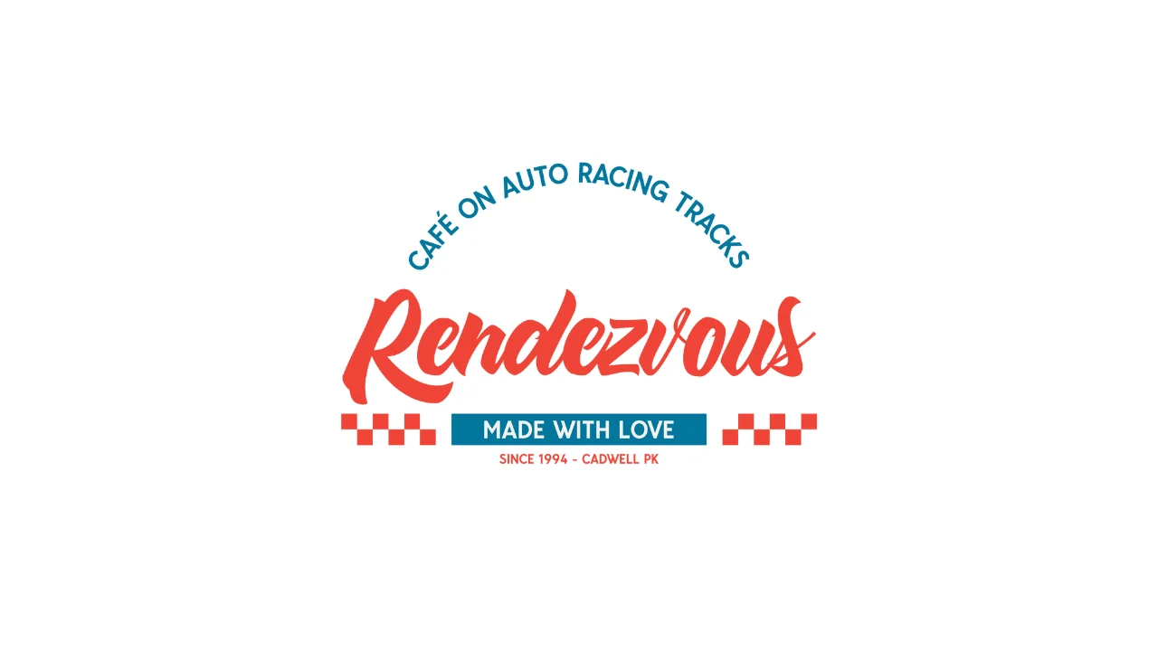
Our task was to create a cohesive brand identity for Rendezvous CAFÉ, capturing the excitement of the racetrack while maintaining the cafe’s welcoming and relaxed vibe. This involved designing a logo and a complete style guide that reflects both the adrenaline of racing and the warmth of a friendly cafe atmosphere.
Goals
Develop a unique visual identity that blends the high-energy spirit of auto racing with the cozy, inviting atmosphere of the café.
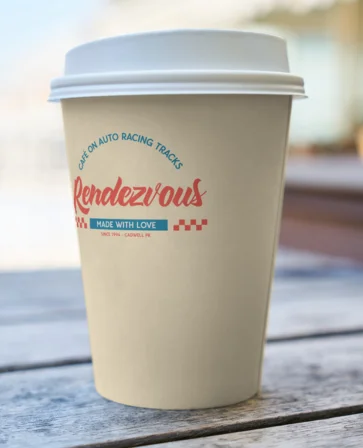
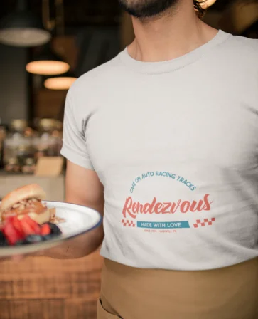
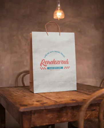
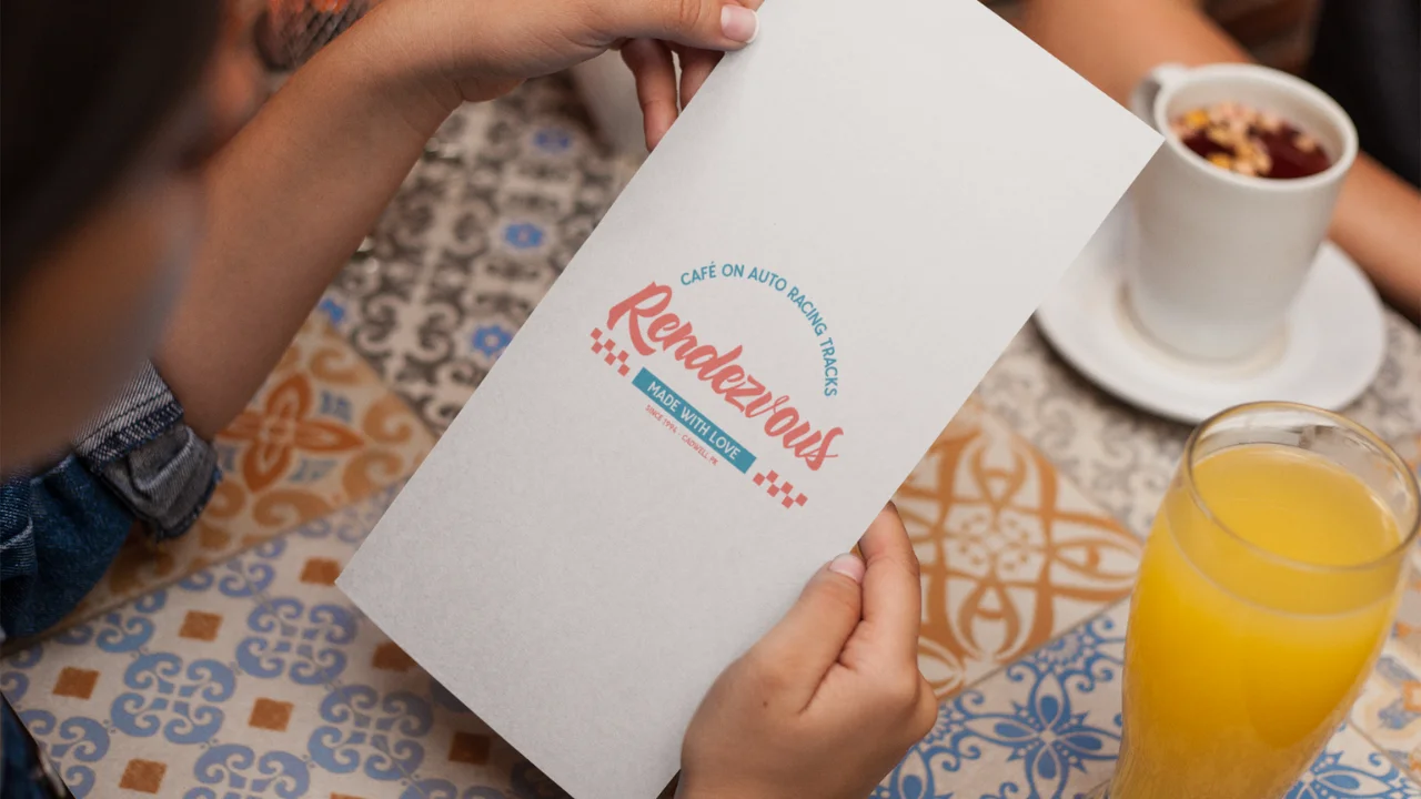
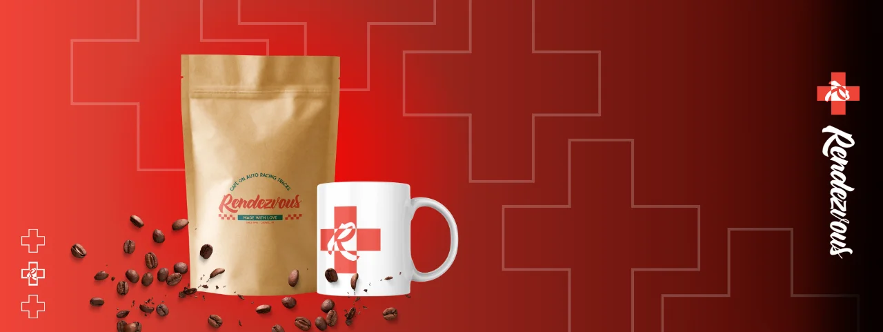
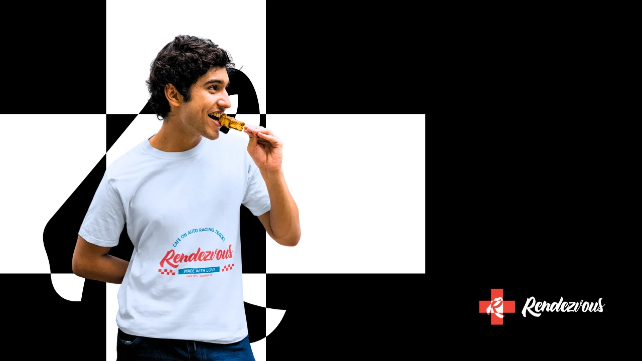
Ensure consistency in brand representation across all materials, including promotional items, staff uniforms, and to-go bags.
Highlight the café’s role as a hub for racing enthusiasts while making the brand approachable for a diverse audience.
Challenges
Integrate the pre-existing bold color palette without overwhelming the design or diluting the café's welcoming nature.
Balance the dual brand identity of a racing-centric yet relaxing café environment.
Maintain clarity and recognizability across all materials, ensuring the logo and branding elements work seamlessly in various formats and sizes.
Approach
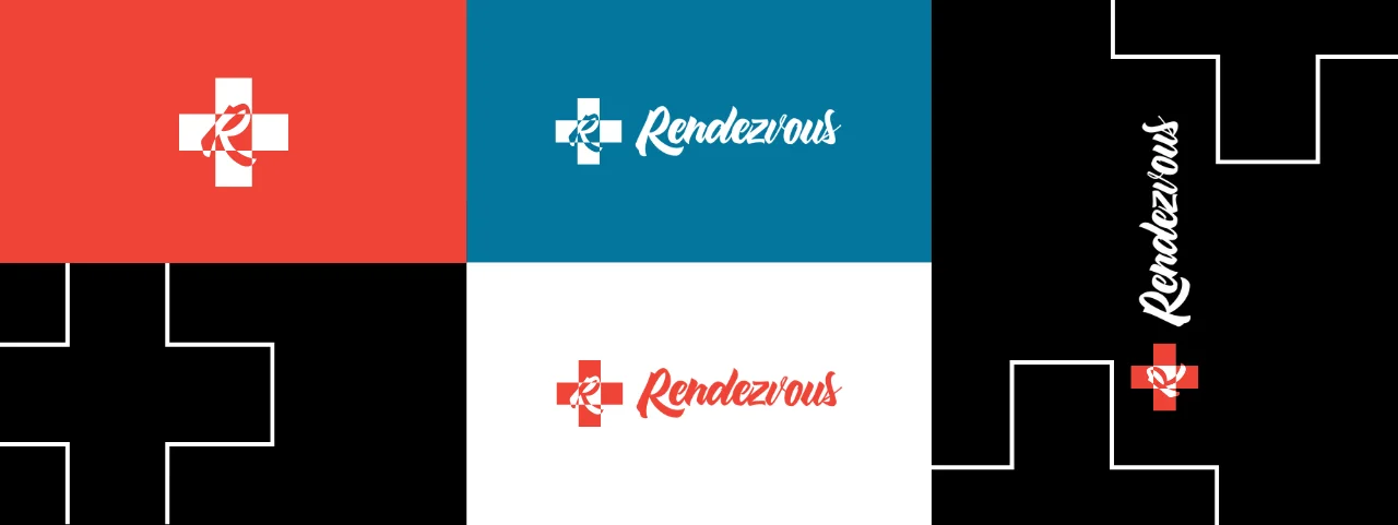
We carefully balanced the café’s existing color palette with the racing theme, maintaining a bold yet welcoming design. The branding integrated elements like tire tracks and coffee imagery to reflect the racing culture, while neutral tones softened the visual impact for a broader appeal. In addition, we ensured the logo and style guide could be easily applied across various mediums, from staff uniforms to printed promotional materials and to-go bags. Our approach allowed for a dynamic, flexible identity that resonated with both racing enthusiasts and casual visitors.
Cascara
HEX: #F04438
RGB: rgb(240,68,56)
HSL: 4°, 86%, 58%
Tofino Blue
HEX: #04769D
RGB: rgb(4,118,157)
HSL: 195°, 95%, 32%
White
HEX: #FFFFFF
RGB: rgb(255,255,255)
HSL: 0°, 0%, 100%
Results
The following are the key outcomes of our branding project with Rendezvous CAFÉ:
Elevated Brand Identity: We successfully merged the racing energy with the cafe’s welcoming atmosphere, creating a unique brand.
Impactful Logo Design: The custom logo captured the essence of racing and relaxation, engaging both racing fans and cafe-goers.
Enhanced Brand Recognition: Branded materials, including staff uniforms and to-go bags, contributed to stronger customer engagement.
Unified Visual Identity: Promotional materials and cohesive design elements bolstered the cafe’s market positioning.
Team Involvement
This project was a collaborative effort that involved multiple key members of the Oriential team
Brand Strategist
Worked closely with the client to understand their vision and ensure alignment with the racing-cafe concept.
Graphic Designer
Crafted the unique logo and promotional material designs that blended racing energy with cafe culture.
Print Specialist
Managed the production of promotional materials, staff t-shirts, and to-go bags, ensuring brand consistency.
Project Manager
Coordinated efforts between the client and the creative team, ensuring deadlines and quality standards were met.
Final Touch of Success
The rebranding journey of Rendezvous CAFÉ concluded with a visual identity that perfectly encapsulates both the dynamic spirit of auto racing and the cozy charm of a café. Our comprehensive approach led to a brand that not only stands out visually but also resonates with customers, enhancing the overall experience at the cafe. From logo design to promotional materials and staff branding, the result is a cohesive and compelling brand presence.
Tools & Software Used
We utilized a variety of advanced tools and software to ensure that the visual identity and branding elements of Rendezvous CAFÉ were perfectly executed. Each tool was selected based on its ability to streamline our design process, ensuring high-quality results. From crafting the logo to producing promotional materials, these tools were instrumental in creating a cohesive and dynamic brand experience.
Adobe Illustrator
Adobe Photoshop
Adobe InDesign
Pantone Matching System
CorelDRAW
Oriential nailed our brand identity, capturing both the adrenaline of racing and the relaxed café vibe perfectly. The logo and design work exceeded our expectations, and the process was smooth from start to finish.
Client Feedback
Our clients’ feedback highlights our commitment to delivering tailored solutions and seamless execution, consistently exceeding expectations and driving business growth.
Stay Connected and Show Your Support
Love what you see? Follow us on Behance to stay updated with our latest creative projects! If this case study inspired you, don’t forget to appreciate it on Behance.