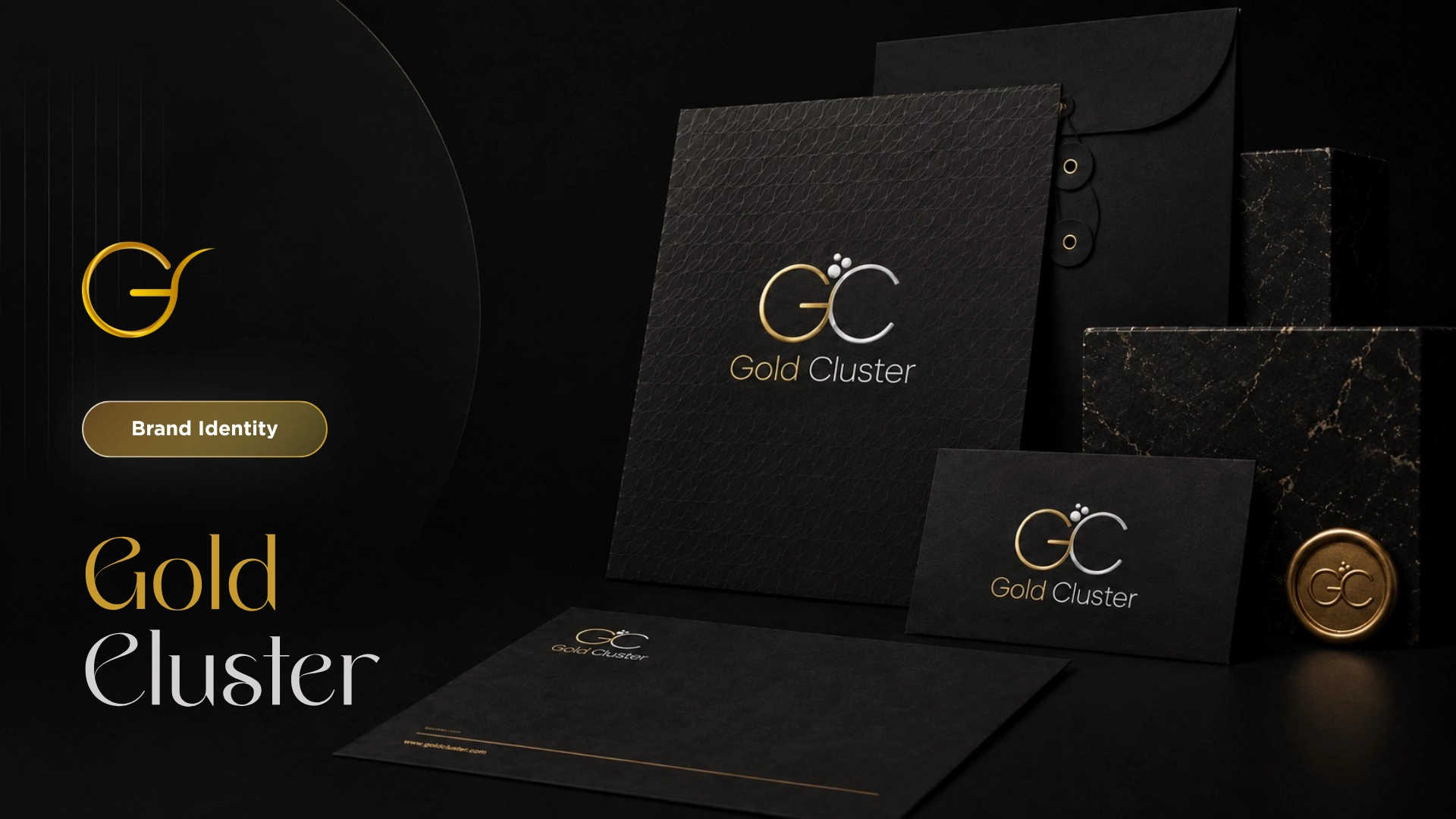
A minimal jewelry identity built around refinement, structure, and stronger visual recognition.
Scope
Strategy, logo, identity
Industry
Jewelry
Year
2025
Role
Brand identity
Client
Saudi-based jewelry brand
Overview
The Project
Gold Cluster was a jewelry brand identity project built around refinement, structure, and stronger visual recognition. The work focused on creating a clean identity system that could make the brand feel more considered, consistent, and appropriate for a competitive jewelry market.
Project Story
What We Changed.
01
Challenge
Gold Cluster needed an identity that could communicate quality without relying on heavy luxury clichés. The brand had to feel refined and recognizable, while staying clean enough to work across different visual touchpoints.
02
Direction
The direction focused on restraint, proportion, and consistency. Instead of making the brand feel decorated, the identity needed to feel structured, polished, and easy to apply.
03
Identity
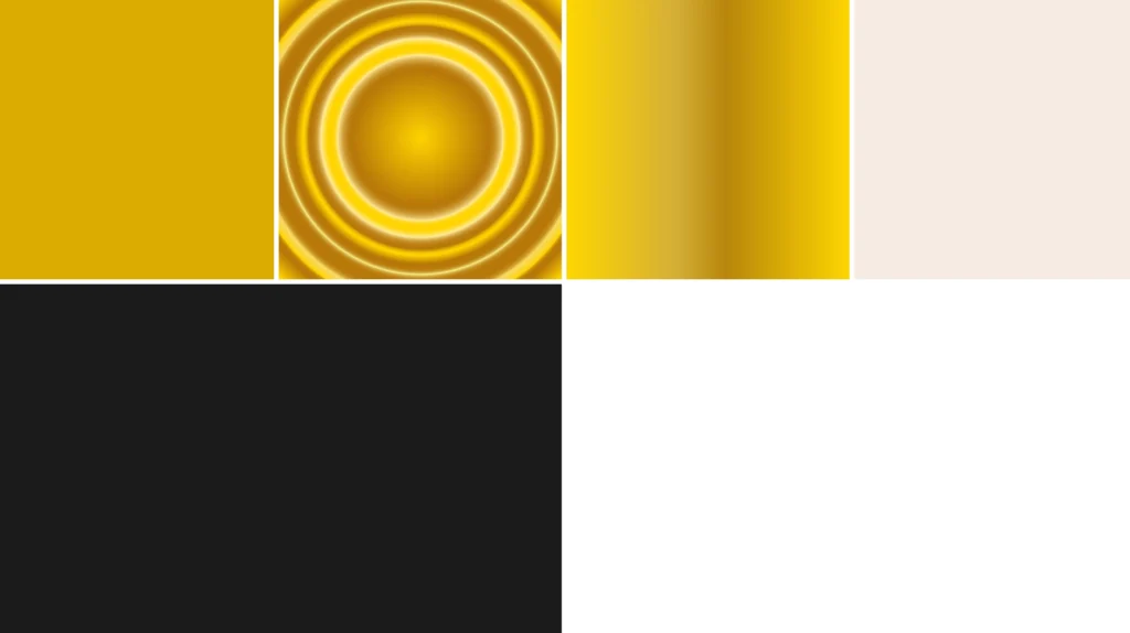
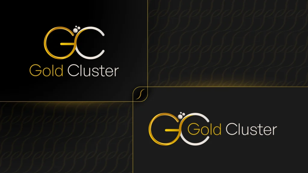
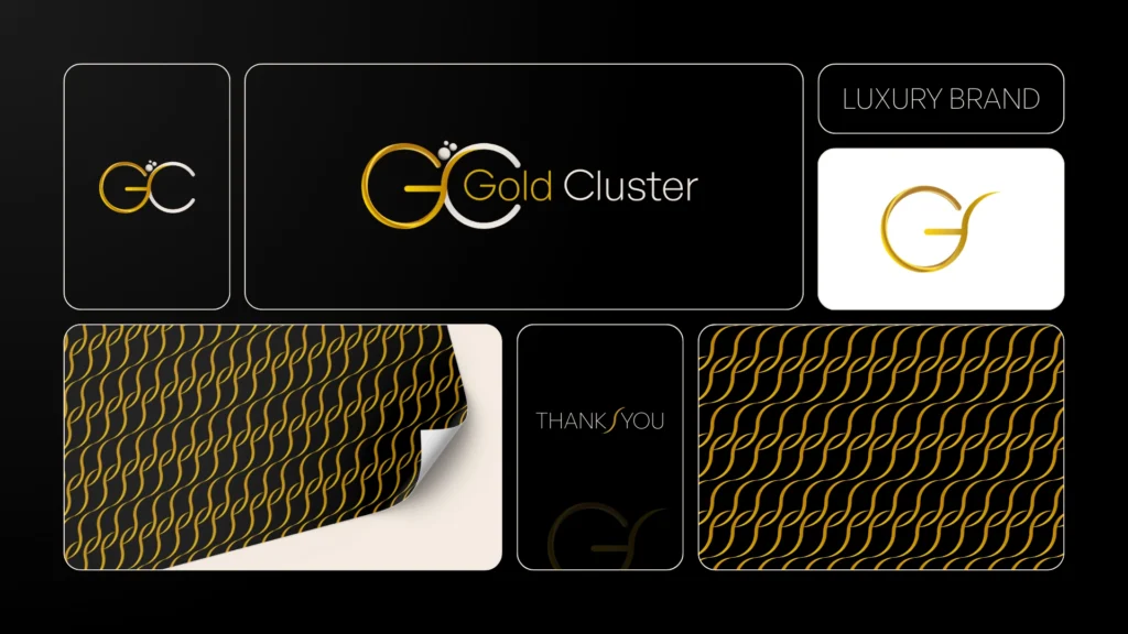
The identity system included a structured logo, typography direction, color palette, and visual rules. Each element was designed to support a refined jewelry presence without making the brand feel overdone or generic.
04
Result
Gold Cluster gained a cleaner and more consistent brand identity with stronger visual recognition. The final system gave the business a more refined foundation for showing up across brand touchpoints.
Visual System
The Work
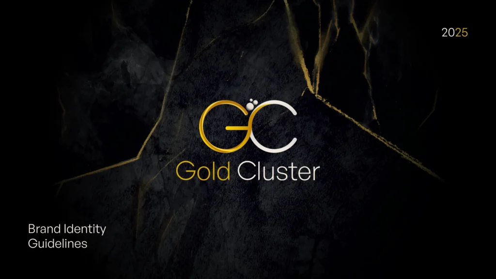
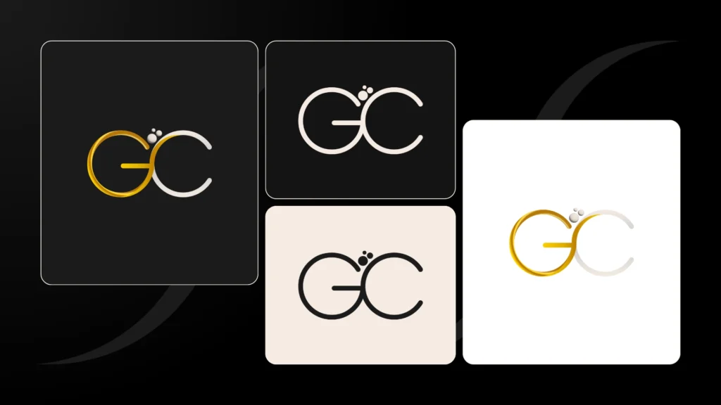
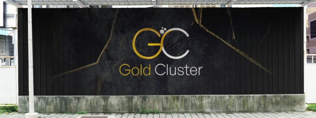
A minimal jewelry identity system showing the logo structure, color palette, typography, and brand applications built to make the business feel refined, clear, and recognizable.
Next Project
Zynoqo
Blagovna znamka
Online Store
2025
A pet ecommerce brand and Shopify store built around clearer positioning, product structure, and shopping confidence.